Chart Legend
A color-coded legend displays at the bottom of the window. Each series in the Chart displays in a different color.

You can hover over a series in the legend to display only that series in the Chart.
In the legend, you can click the  button in a series row to remove that series from the Chart.
button in a series row to remove that series from the Chart.For state-related data (see Defining a Product), each value in the color-coded bar for a reading is represented by a different color. The same scale applies for both telemetric data and the status data in the color-coded bar.
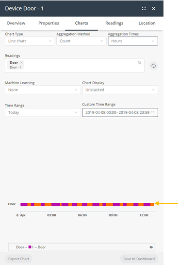
For example, the example below shows two types of status-related readings – one for Status and one for Tamper.

You can hover over a value in a color-coded bar to see more details about that value.

Charts can also be saved to a Dashboard (if one exists) or can be exported in various file formats.
To create a Chart, you specify the following information for it –
Note ‒ Currently, Chart definitions cannot be saved for reuse.
Field | Description |
|---|---|
Chart Type | Specifies the type of Chart to be created. The following chart types are available: • Line chart • Smooth chart • Column chart • Area chart • Pier chart • Scatter chart • Heatmap |
Aggregation Method | Specifies the method used to aggregate data in a series. • None means that no method is applied to the data, so that only raw data is returned. • Duration means that data is aggregated based on how long the device was in a specific state. The data represents the total time that a device or product was in each state. Data is then aggregated based on each state. |
 | |
Note that aggregation methods typically do not apply to status data, as described below | |
When the Aggregation Method is None, status data displays in a color-coded bar beneath the Chart instead of in the Chart itself. | |
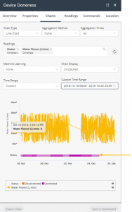 | |
When the Aggregation Method is Count, then status data displays in a color coded bar beneath the Chart. This is the only case where results using an aggregation method display in the color-coded bar, instead of the Chart. | |
 | |
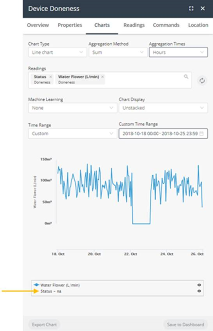
When the Aggregation Method is any value other than None or Count, such as Sum, Average and so on, then status data for the reading does not display in the color‑coded bar beneath the chart, and instead shows na next to its reading in the legend. | |
 | |
Example Let’s look at an example in more detail. Assume that you have an assembly that can either be Connected or Disconnected. When the Aggregation Method is Count, then there is no real relationship regarding how long a given status (Connected vs Disconnected) existed. The Count aggregation only counts the number of times each value was received during a given timeframe. In this case, there is no relationship to how long the status lasted. 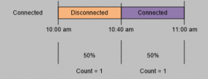 In contrast, when the Aggregation Method is None, then the amount of time that a given status existed is relevant. The following would show that the bar would show that it was Disconnected for two thirds of the time (meaning 40 minutes of the hour) and that it was Connected one third of the time (meaning 20 minutes of the hour). 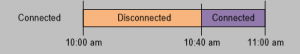 | |
Aggregation Times | Specifies the interval at which data is aggregated. For example, if the Aggregation Method is Sum and the Aggregation Times value is Hours, then the data in the Chart represents the sum of the values during that hour. • All • Minutes • Hours • Days • Weeks • Months • Quarters • Semesters |
Readings | Select the reading(s) to be included in the Chart. Each reading type in the Chart displays in a different color and series. |
 | |
Machine Learning | This feature is part of the IoT Platform Analytics Package, which enables you to forecast or predict the readings in the next time period based on algorithmic calculations. Different algorithms are used for the Forecast Linear and Forecast Quadratic options. The following options are available: • None • Anomaly detection • Forecast linear • Forecast quadratic |
The Anomaly Detection option identifies single readings that deviate from the readings trend within the time period for the chart.  You can contact IoT Platform support for more for details about adding this feature to your system. | |
Define a Y-axis range by reading | Per available device readings, you can specify a minimum and maximum value for the respective Y-axis. This feature enables you to more easily compare different readings in the same chart. In the following example, both Y-axes show a custom range: • Min = 20 • Max = 60 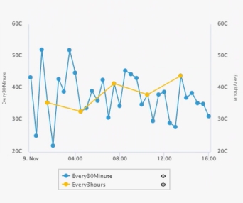 |
Chart Display | Specifies the type of Chart to display. The following options are available: Shared – Shows all readings with a single Y axis.  Stacked – Shows all readings at one level, where each reading has its own Y axis and units.  Unstacked – Shows all readings one on top of another. Each series does not necessarily use the same scale.  |
Time Range | Specifies the day(s) and time range of the Chart.  |