Defining a Product
Procedure
1. In the left pane of the IoT Platform Portal, click  Templates > Products.
Templates > Products.The following window displays:

 | This window lists the Products currently defined in the system. |
2. Click the  button. The following window displays:
button. The following window displays:
This window contains three tabs General, Events and Properties.
3. Fill in the following fields in the General tab, which specify general characteristics of the Product.
| | An asterisk (*) indicates a mandatory field. |
Field | Description | ||
|---|---|---|---|
Name | A free-text field specifying the name of the Product. | ||
Manufacturer | A free-text field specifying the name of the manufacturer. | ||
Icon | Indicates the icon to represent the Product on maps and diagrams in the IoT Platform Portal. Click the Icon  button to display the following window in which you select the icon to be used. After selecting an icon in this window, the selected icon displays in the Icon field. button to display the following window in which you select the icon to be used. After selecting an icon in this window, the selected icon displays in the Icon field. | ||
 | |||
Description | A free-text field that describes the Product. | ||
Readings Display Configuration | In this area, you define the information that is shown in a tooltip when you hover over the Device icon in an IoT Platform map or diagram. You can select up to three different events. The tooltip displays the last reading of each selected event.
 The following shows an example of a tooltip displayed on a map that has three events defined for the Product.  | ||
Additional Properties | In this area, you can enable/disable various properties for the Product. | ||
 | |||
Display Custom ID | When enabled, the Custom ID of the Device is available in the IoT Platform Portal for all Devices under this Product. The Custom ID of a Device is the Device’s unique identifier under this Product in an external system. It enables the correlation of the IoT Platform Device ID with the external system’s Device ID. | ||
Custom ID Read Only | When enabled, the Custom ID of the Device is available in the Read Only mode only. | ||
Display Serial Number | When enabled, the serial number of the Device is available in the IoT Platform Portal for all Devices under this Product. | ||
Enable Developer Mode | When enabled, displays additional developer details for the Device in the Device’s Properties This information is for third‑party developer use when integrating with the IoT Platform gateway. | ||
Enforce Custom ID | When this check box is selected, the custom ID is mandatory when defining a Device under this Product. | ||
Enforce Serial Number | When this check box is selected, the serial number is mandatory when defining a Device under this Product. |
4. Click the Next button to move to the Events tab in the window or simply click the Events tab –
| | Devices for a certain Product will display Readings/Event which are sent by the actual sensor/system and mapped, the Events do not have to be added to the Product. IoT Platform uses an Events Manifest which specifies for each Event the Icon, Units, Type code, Data type,... Specifying an Event in the Product is required when: • Changing the manifest default settings for Events (for example the Units displayed, Adding a label, Icon..) • Enabling the selection of the Main Reading and Tooltip • Changing look and feel (icon and color for data ranges/Boolean/allowed values..) • Enabling the display of Things Readings in some Widgets requiring Groups and ranges (such as the ‘Overall Reading’ widget) |
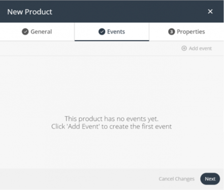
In the Events tab, you can add events to the Product definition (not mandatory). An Event is data received by the IoT Platform Server from a Device.
A reading consists of the reading name, reading type, reading value and reading timestamp. For example, a reading from a scale, the temperature from an air-conditioning system, the action of turning on a light, the periodic status of a light (open or closed) and so on.
These Events then appear in the IoT Platform Portal for each Device that belongs to this Product. These Events are also available to be selected when defining the tooltip that appears on the map showing Devices that belong to this Product.
You can define as many Events as you like. There are no dependencies between Events.
5. Click the  button. The following displays –
button. The following displays –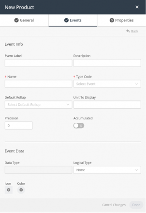
6. Fill in the following fields in the Events tab, which specify details for the Event –
| | An asterisk (*) indicates a mandatory field. |
Field | Description | ||||||||||||
|---|---|---|---|---|---|---|---|---|---|---|---|---|---|
Name | A free-text field specifying the name of the Event sent by the Device. The name that you specify here must be exactly the same as the name sent by the Device in order to be identified by the IoT Platform system. | ||||||||||||
Type Code | Lists the types of events supported by IoT Platform . Each event type has its own logical data type, such as Boolean, integer, double and so on. Select the applicable event type in the list. | ||||||||||||
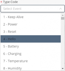 Status 30 When specifying the type of reading, keep in mind that Type Code 30 - Status is a reserved system status to denote whether a device is either: • 0 - Connected • 1 - Disconnected Because it is reserved as a system status, when choosing this type, the settings are predefined and greyed out indicating that it is read-only. | |||||||||||||
Description | A free-text field that describes the Event. | ||||||||||||
Default Rollup | Specifies the default aggregation type used by the IoT Platform platform when displaying charts for the Devices under this Product. | ||||||||||||
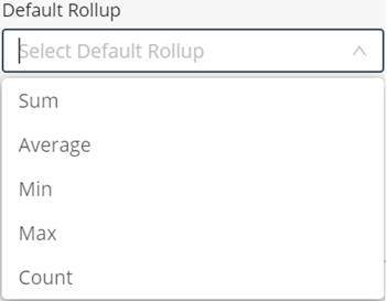 | |||||||||||||
Note ‒ Device-related settings are defined when you define a Device. Device settings such as the Aggregation Method are fixed and cannot be changed. This means that whenever you select a Device under this Product, then the Device uses the aggregation method defined here by default. If you prefer a different aggregation method when viewing a chart for that Device, then you can change it in the Device’s Charts tab, as shown below. Making such a change locally for a Device does not affect or change the Default Rollup setting for the Product. 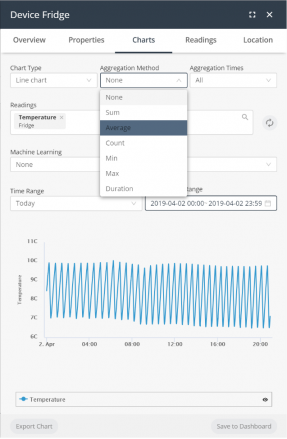 | |||||||||||||
Unit to Display | A free-text field that specifies the unit used for the Y axis in all charts displayed for Devices under this Product. | ||||||||||||
Precision | Specifies the number of decimal places that display in charts/things for Devices under this Product. | ||||||||||||
Accumulated | When enabled, indicates that the event contains an accumulated value. For example, an electrical meter. When this setting is enabled for an electrical meter Device, IoT Platform reads the value differences between each Event and calculates the delta from the previous reading. | ||||||||||||
Data Type | A read-only field that displays the data type of the Type Code (see above) that you selected previously. | ||||||||||||
Logical Type | Specifies the default logical type of the reading for the Event. Even if no Logical Type is specified, the Event is not dropped and is displayed as it was sent from the Device. Options are: • Boolean – Two possible values are permitted, such as Yes/No, 0/1, Open/Close and so on. • Allowed Values – Specifies a defined set of values that can be set by the Device. • None – This option only indicates that the event occurred, but does not display any additional information about it in charts or maps. • Range - to be used as readings' filter. You can also specify a range as a logical series (each with a Range minimum and a Range maximum, an icon and a color). This will provide a clear and instantaneous insights in key indicators. For example, a battery status with the following ranges:
Result The data, received from the IoT Platform, will subsequently be displayed in the Planon application - See Viewing device data. | ||||||||||||
Filter | This option dynamically appears when selecting Range as Logical Type. A check box appears that adds filtering functionality to the defined range. Any value not within the defined range is filtered out when the check box is selected. (This allows you to exclude reading anomalies). | ||||||||||||
Value, Label, Icon and Color | In these fields, you can configure how each value appears in charts or maps by specifying a label, icon and icon color for a value, as shown below. For example, let’s say that this Event is for a door, which can be either open or closed. As shown in the example below, the Device for this Event sends either 0 or 1 to indicate when the door is open or closed, respectively, making this an Integer Data Type with Boolean values. When the door is open, the Open label displays on maps and in charts in dark red , and when the door is closed, the Closed label displays in dark purple . If the device has more than a single event, the main event defined in the Product display configuration determines the Device’s color on the map.  • Value – You must be familiar with the data sent by the Device in order to specify the proper value in this field. The value that you specify must be identical to that sent by the Device. • Label – This is a free-text field that represents the label that displays for the specified value in charts or maps. • Icon – Indicates the icon that represents the value on maps and diagrams. Click the Icon  button to display a window in which you select the icon to be used. After selecting an icon, the selected icon displays in the Icon field. button to display a window in which you select the icon to be used. After selecting an icon, the selected icon displays in the Icon field.• Color – Indicates the icon color that displays on maps and diagrams for the value. Click the Color button to display a window in which you set the color for the icon.  |


7. After defining all properties of the Event, click Done.
The Event displays in the list of Events in the Events tab.
Simplifying creating Events
In order to simplify creating Events that correlate to the ones used by devices, under a specific Product there is a functionality in the device readings which allows adding Events to the Product:
1. Go to Things/Devices.
2. Select a device.
3. Select the Overview tab.
4. Whichever Readings requiring an Event added in the Product – hover over the 3 vertical dots in the upper-right corner of the reading and click.
5. A dialog box appears with the options to either Delete the reading or to Add Reading to Product:
- Delete: Will delete the reading from the device UI (will still be available in the DB and Readings tab).
| | If a new reading is sent, this will again be populated. |
- Add Reading to Product: This option will add an Event to the device’s Product populating the Type and Name of the Event (which together are the unique identifiers). This new Event can be used to further manipulate the look and feel of the reading.
8. Click Next to move to the Properties tab or simply click the Properties tab –
In the Properties tab, you can add additional properties to the Product definition (not mandatory).
These additional properties then appear in the IoT Platform Portal for each Device that belongs to this Product. You can define as many additional properties as you like.
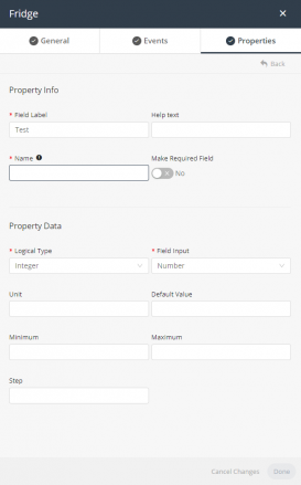
9. Fill in the following fields in the Properties tab, which specify details for the additional property –
| | An asterisk (*) indicates a mandatory field. |
Field | Description |
|---|---|
Field Label | The name to appear in the IoT Platform Portal for this additional property. |
Help Text | A free-text description of the additional property. |
Name | The internal logical name to be used for this additional property. This name must match the additional property’s name on the Device itself. |
Make Required Field | A true/false field indicating whether this additional property is mandatory. |
Logical Type | The data type of the additional property. The Logical Type indicates how the data for the property is to be displayed on the Device. Options are: • Text – The value for the additional property is text. 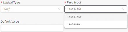 When selecting this option, you must also specify the Field Input, which can be either Text Field or Text Area along with the applicable Default Value for the additional property. A Text Field displays a single field for the data entry when displayed on the Device. For example, the color additional property, shown below, shows a single field in the Device’s properties when you select Text Field as the Field Input value for the property – 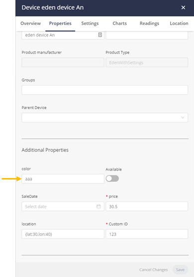 A Text Area displays a multi-line entry for the data entry when displayed on the Device. For example, the color additional property shows a multi-line field in the Device’s properties when you select Text Area as the Field Input value for the property – 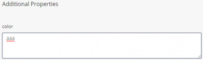 • Decimal – The value for the additional property is a decimal number.  When selecting this option, you must also specify values for the following fields – ◦ Field Input – Select Number, which indicates that the data is numeric. ◦ Unit – The unit for the additional property. ◦ Default Value – The default value of the additional property. ◦ Minimum – The minimum value for the additional property. ◦ Maximum – The maximum value for the additional property. ◦ Step – Indicates the step used to increment the values for the additional property. For example, if the Minimum is 10, the Maximum is 20 and the Step is 2, then the following values can be entered ‒ 10, 12, 14, 16, 18, 20. • Integer – The value for the additional property is a whole number. 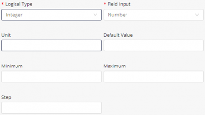 When selecting this option, you must also specify values for the following fields – ◦ Field Input – Select Number, which indicates that the data is numeric. ◦ Unit – The unit for the additional property. ◦ Default Value – The default value of the additional property. ◦ Minimum – The minimum value for the additional property. ◦ Maximum – The maximum value for the additional property. ◦ Step – Indicates the step used to increment the value for the additional property. For example, if the Minimum is 10, the Maximum is 20 and the Step is 2, then the following values can be entered ‒ 10, 12, 14, 16, 18, 20. • Allowed Values (Text) – The value for the additional property can be selected from a list of text values. 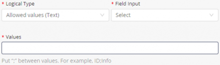 When selecting this option, you must also specify the Field Input, which can be either Select or Radio Button along with the applicable Values for the additional property. 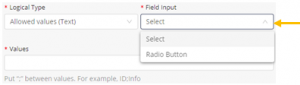 Separate values in the Values field with a semicolon (;). 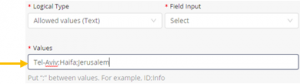 When you select Select in the Field Input drop-down menu, the Device properties display the additional property using a drop-down menu, as shown below – 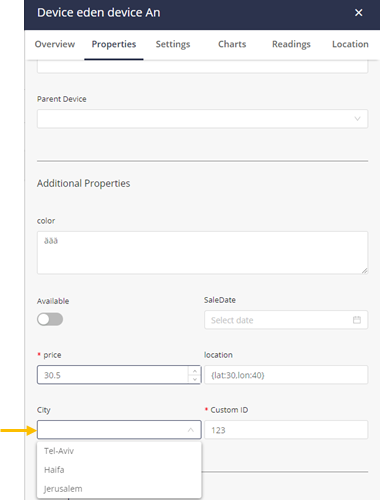 When you select Radio Button in the Field Input drop-down menu, the Device properties display the additional property using radio buttons, as shown below –  • Allowed Values (Number – The value for the additional property can be selected from a list of numeric values. 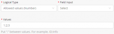 This option is similar to the Allowed Values (Text) option, except that the values you specify are numeric instead of text. When selecting this option, you must also specify the Field Input, which can be either Select or Radio Button along with the applicable Values for the additional property. Separate values in the Values field with a semicolon (;). • Boolean – The value for the additional property is Boolean (yes/no, true/false and so on). 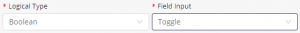 When selecting this option, you must also select Toggle in the Field Input field. |
10. Click Save to save the Product definition.