Charts Tab
The Charts tab enables you to visualize the data collected by IoT Platform for the Device.
You can display multiple readings in the same Chart (from the same device or different devices), in order to better understand the relationship between the data series.
For example, how humidity affects temperature or how power consumption affects a device’s temperature or compare power consumption of 2 different devices.
You can create a Chart whenever you want to graphically present Device data and/or for further analysis.

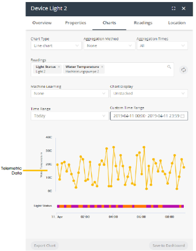
A Chart presents telemetric readings data in a graph, as shown above. Telemetric data includes data whose logical type is None, Range or Allowed Values (State), as defined for the Product (see Defining a Product). For example, temperature readings.
In addition, a Chart presents status data as a color-coded bar(s) beneath the chart. Chart data includes data whose logical type is Allowed Values, as defined for the Product (see Defining a Product). For example, a Device that is Connected or Disconnected.
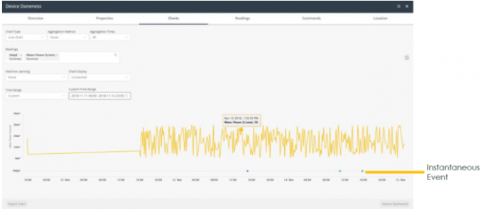
Charts that include an instantaneous event show the data for that event below the graph. Instantaneous events do not have values. Each time that the instantaneous event occurred is represented by a colored diamond. For example, the chart below shows two instantaneous events – Help and Help2.
