Supported chart types in Web Configuration
The following section list the supported chart types.
For an overview of availability of attributes per chart type, refer to Attribute availability. |
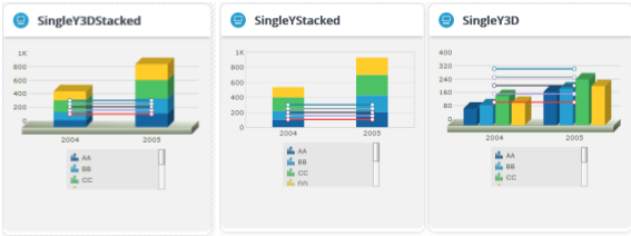
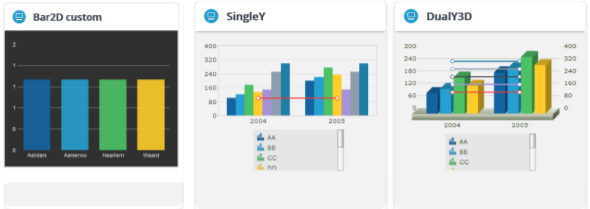
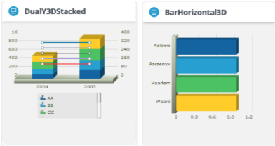
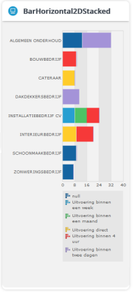
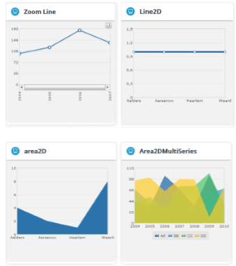
Column and bar charts
Column charts and bar charts are used to compare the values of individual data points with one another. They help in bringing out the highs and lows of the data set very easily.

Line and area charts
Line and area charts are used to show trends or performance over a period of time.
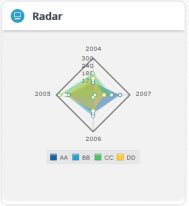
Radar charts
A radar chart is a very effective tool for comparing multiple entities based on different characteristics. For example, they can be used for comparing various spaces based on their thermal efficiency per m2, space occupancy.
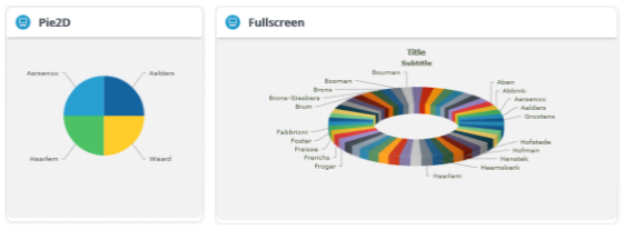
Pie charts and doughnut charts (2D and 3D)
A pie chart is a circular chart divided into sectors, where the arc length of each sector, its central angle and its area is proportional to the quantity it represents.

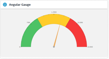
Gauges
Gauges are value indicators that are used in dashboards, real-time monitors and reports. They are used to display Key Performance Indicators (KPIs), progress indicators and quantity indicators.
Candlestick chart
Typically, the Candlestick chart is used for analysis of equity and commodity prices. In the ITSM domain, it could, for example, be used to show the range of open IT service calls. With a candlestick chart you can show the opening number, closing number, highest number, lowest number and the volume put together on a single chart.
