My jobs
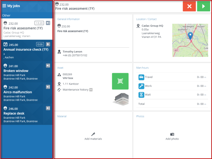
The screen layout is designed to give you an optimal overview and control over your work. All essential information and functions are accessed from the main screen, which is divided in two:
• My jobs, containing the actual job list
• the job summary, giving access to blocks with the selected job’s details

The job list header includes a hamburger menu icon. Tapping this button will show the menu side bar, where you can log out of the app. The job list itself is ranked by date-time and whether jobs are High priority ( ). Icons indicate the job’s type and status. You start by selecting and accepting a job from this list. See Job icons for more information on the icons.
 ). Icons indicate the job’s type and status. You start by selecting and accepting a job from this list. See Job icons for more information on the icons.
You can search through the job list by using the filter. See Filtering the job list.
If the scheduled date of a job passes and you have not picked it up yet, this job is moved to a separate, highlighted Overdue section, just below the jobs in progress. This means it is time to take action: you may need to consult with your back-office and either accept or reject the job. |
The summary header shows all details of the job you have selected and give access to the action buttons you need to change a job’s status, for example to accept or reject the job, to start, travel, pause, discontinue and so on. The summary itself consists of several summary blocks, each offering essential pieces of information and interaction on the selected job.
Screen layouts in the user information might deviate from your actual screen, due to updates and improvements to the app. |